

Welcome to the New Website
Welcome to the version 5 of francisrub.io. I sat down with Francis Rubio to talk about the process and development of how it got here.
When this website was first created in 2018, it was nothing but something cute to put out there in the open. But through the years, it shaped up to become a masterpiece that tells not just a story, but also a vibe. And it’s once again shaping up to tell a different story and a different vibe. We sat down with its developer and creator, Francis Rubio, to talk about why websites are an art form that’s more than its utility, and how he did this new one.
If you are interested in the evolution of this website’s design, you may take a look at the previous post in this series.
It’s time for a redesign
Interviewer: Hi Francis! It’s a pleasure to have you here.
Francis: Thank you! It’s an honor to be here honestly, at this imaginary magazine interview. I’ve never been to one of these before. Thank you for having me.
Interviewer: Yeah, it’s kind of weird right? Anyway, let’s dive right into it! You have teased this website for a long time, ever since that banner first appeared that announced a date: June 27. Take me back to where it started. What was that spark that made you say “Okay, let’s tear this old site down and build a new one”?
Francis: It’s become a tradition of mine, at this point. Every year, the website has a new design. It doesn’t have to be a significant jump, though. In the past two or three years, the changes were incremental. Although the imagery and banners changed, the majority of the vibe and theme remained the same.

This year’s is different though. It’s less of a decision to revamp, and more of it making sense to do one. Frankly, a lot of what I do with design are influenced by the personal transformations I go through, and especially with my personal website, I feel like the previous design (which has been around for about two or three years at this point) no longer represented me accurately. I still think it was one of the best things I’ve done; there’s a reason why it remained largely unchanged for a long time. But it also kind of got old eventually, and I just wanted to do something new.
Interviewer: According to your official chronicle of your website redesigns, the previous iteration has been around since 2022. That has to be difficult, having to start from scratch, no?
Francis: It is difficult. I just cannot let go of it. (laughs) I even archived it because I thought it’s got too much history with it to just let it all disappear, so the previous iteration is still out there somewhere.
Interviewer: I had a feeling you’d say that! It’s years of accumulated ideas, I can’t imagine it would be easy letting go. But let’s take a look backstage. Since the previous iterations, were there any technical decisions you made that you would’ve done differently previously?
Francis: I think a major thing I concerned myself with this year is this perspective I have about JavaScript. I’d always been in the camp of “don’t use JS unless it’s totally needed!!” but through the years I realized that it’s easy to be very opinionated about the tools and materials we use that we end up limiting ourselves. So for this iteration, I became more generous with JavaScript. I got animations in there, some new interactions, and stuff that you just cannot do with HTML and CSS alone.
Also, I don’t think it’s been talked about enough how vital JS is to
create accessible web components. There are interactive components
out there that cannot be accessible without a tiny bit of JS. I’m
thinking of those CSS-only accordions or dropdown menu. I can’t
imagine those would do well in a production environment where you
have actual users, although I think GitHub had such a component a
few years back where
they used a <details> element for their
dropdown component, but that’s besides the point.
Being more generous with scripting is what I worked on in this iteration. But that is not to say that it’s being done irresponsibly! Of course we have to still consider things like file sizes, bandwidth, coding standards, the like.
Interviewer: But you also said that it “got old”? Can we delve deeper into that? What was it specifically—the color palette, the layout? Or did you feel that you were constrained? What was it that just didn’t hit the mark anymore?
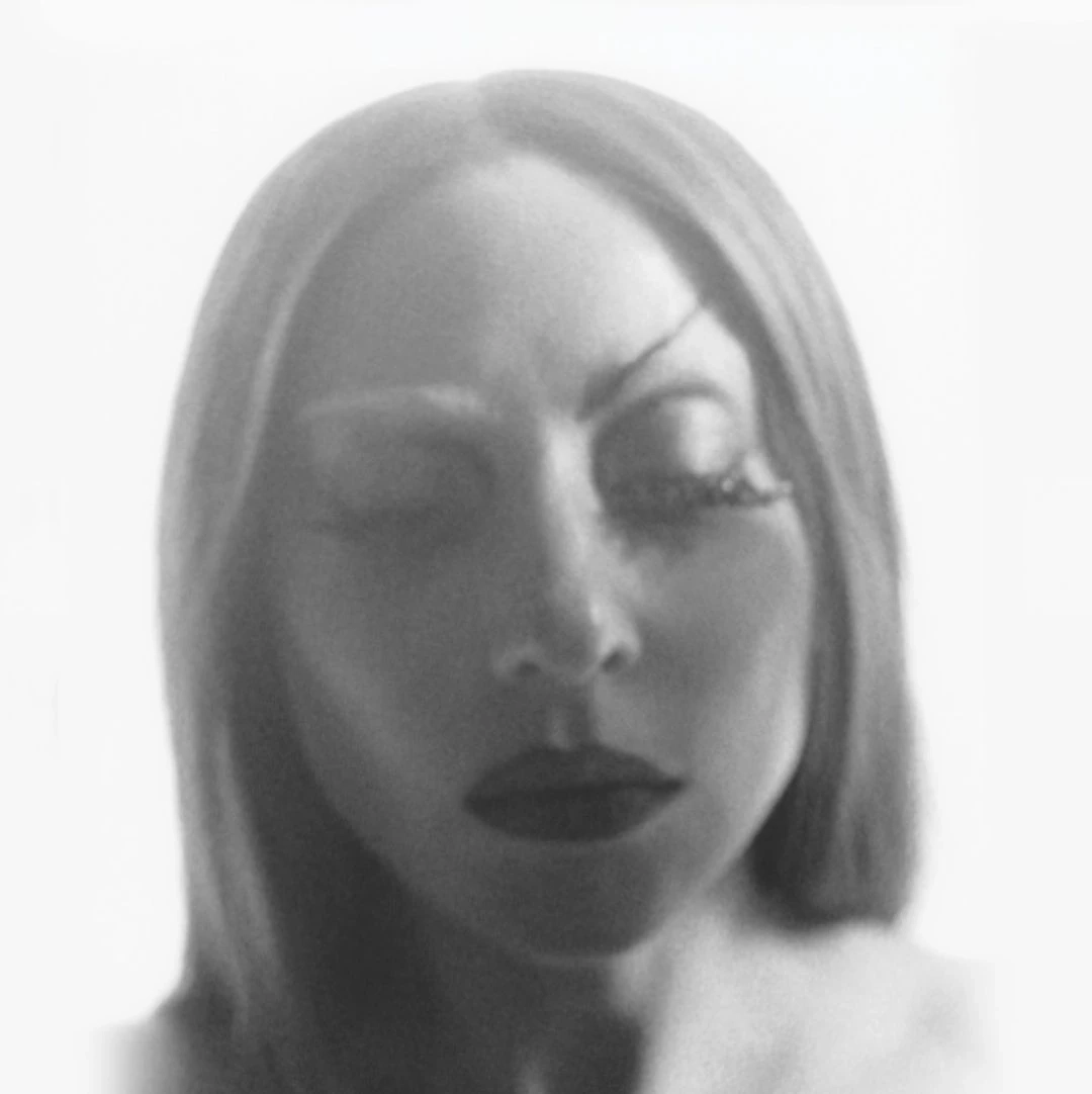
Francis: Well, you see, the website was really bold. I described it before as like, if a night at a club was suddenly transformed into a website. That’s what it was. It was bold and chaotic and colorful. The core concept was being bold and fearless with the design. No idea is to be dismissed; it’s gotta be shoehorned in there somehow. And that’s what made the previous version get its chaotic personality. And it’s because I sort of just felt everything out when I was making it. There was no science to it; I just tried things out, and whatever felt right, I left it in there. Actually, if I was a third person looking at the previous design, I would be like “oh, this site is like someone got pieces everywhere and put them together in a messy way and called it camp!”
But for this iteration, I wanted a more controlled chaos. I still operated on just feeling things out because that’s what comes naturally to me. But I wanted the chaos to be more intentional. I wanted every detail to have a reason behind it instead of it just being cool to look at (which is a totally valid thing to do on a personal website, by the way).
The art of intentional chaos
Interviewer: The chaos has to be intentional. Wow. That’s a shift in philosophy. When you talk about bringing more intention to the chaos, what does that practically mean for the user experience? How will someone navigating this new site feel that change from the previous iteration’s “camp” energy?
Francis: The chaos is more subtle. And it’s not a fun kind of chaos. It’s not a night at a club party. It’s more of a peaceful night minding your business, doing whatever, and then things start to fall apart slowly.
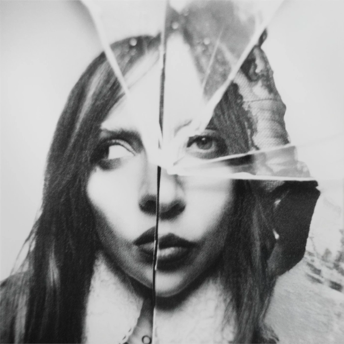
I wanted the website to look like every other website out there, but in the interactions, you feel the personal touches that were deliberate. When you hover over links and buttons, you see what lurks beneath is a glass pane cracked and broken. When you click on navigation links, the marking on the active links are scribbles instead of just a typical text color change. The imagery is also dark in aesthetic.
The chaos is more subtle.
Interviewer: Controlled chaos. That’s almost like a reflection of the human experience itself doesn’t it? The tension between what’s presented and what’s felt. And earlier, you said that you wanted your website to accurately reflect where you currently are.
What does this subtle chaos say about you right now?
Francis: (laughs) Being personal and sentimental talking about a website redesign is kinda weird and overdramatic, I think, for most people. But for me, that is where this entire thing truly comes from. What I put in my website is a true mirror of where I am in life right now. And right now, I am in a process of discovering more and more of the dark patterns in my life. And before, I masked it in a fun way, like I’m the quirky traumatized drag queen or something. But now, I’m at a place where I’m more willing and knowledgeable to tackle these stuff face first.
Interviewer: And that quriky feel was accurately represented in the previous iteration, too.
Francis: Yeah! Exactly. But going back… that is also why in this redesign, I created an alter ego. I tell the story of Nico Bursafi, a character I created. His name is an anagram of mine, and that’s because he’s everything I see of myself in a timeline where I had been overwhelmed with shame that I lost myself in the process.
Interviewer: Ah! So that’s what that’s about. This whole time, I thought you just decided to serve cunt! That’s kinda your thing, too, right?
Francis: (laughs) Are we allowed to say cunt here?
Interviewer: Of course! This is your website! (laughs)
Francis: Oh girl. But yeah, the man you see everywhere is an alter ego. I wasn’t just randomly putting pictures of me everywhere. Like I said, I’m trying to be more intentional this time around.
Interviewer: Right. We are getting a fuller picture of what you are trying to paint. So this iteration is a visual language of confronting the shame. I’m assuming a lot of that also comes from your experiences growing up as a closeted queer person?
Francis: Of course. Yeah. A lot of my experiences growing up gay shaped me into who I am today. And sadly, those experiences are stained by shame. Life as a gay is a life of shame, as they say. 1
Interviewer: Right. But with the launch of this website, you’re also introducing Nico Bursafi into the world. How does that feel, that this deeply personal work is about to be seen and experienced by others?
Francis: I’d always been introspective, but there’s a lot of things I realized, especially now that I’ve been to therapy for about two years now. And one of the major discoveries I had was just how much shame I had in me, and how much it influences the actions I take.
You see, Nico is a visionary. Well, used to. But he grew up in an environment that shamed him for being true to himself. Whether intentionally or unintentionally is besides the point, because he still ended up becoming too conformant, too concerned about how he is being seen. And he comes into this realization that the shame had limited him so much that he doesn’t know how to progress further.
And that broke him so much that he devolved into this fantastically deranged husk of his former self. He became a rebel, a menace to the society. He had hoped that this devolution, this apoptosis of sorts would equip him with bigger and prettier butterfly wings to freedom that would enable him to embrace who he really is. But even then, even when he developed a resolve to reject the shame being put against him, he’s still concerned about what people would think. He’s still gotta wear nice outfits. he’s still gotta wear makeup. He’s still gotta look like a model. He’s still gotta be picturesque. He’s turned into public enemy #1, and he still has to serve while doing it so he gets a fanbase that validates him and roots for him—again, an existence borne out of shame.
And more importantly, he realizes that he’s wearing the costume of rebellion as a protection to keep him safe from the perceived dangers that may or may not be real. And that reaalization brings him to an epiphany that in an effort to find himself, he has walked further away from his truth, but now he’s in too deep and he thinks there’s no going back from this. He’s got that shame of a prodigal son; he has anticipatory shame around what his peers would say about him, how his circle would feel, or whether he still has a circle. So he keeps the façade.
Interviewer: That’s… an incredibly powerful, incredibly vivid portrait of a character. And I find it really interesting that even in his rebellion, he still feels the need to conform in some way. That’s contradicting.
We are partakers in the act of creation, whatever that creation might look like.
Francis: Yeah, it’s ironic. But that’s how shame works. It doesn’t make sense.
Interviewer: With this rich lore you created just for this redesign, how does Nico manifest on the site itself? Is he directly present, or is he more symbolic? How does his existence influence the design and development of version 5?
Francis: He’s actually everywhere. He lurks somewhere in the background. In some pages, he’s front and center. But going back to what we talked about earlier, he also manifests himself into this controlled chaos. In previous iterations, the website used bold colors and different designs for similar components. When you look at it, it really was a mishmash of multiple ideas merged into one product. But for this iteration, I made design choices that are “influenced by shame” so to speak.
The website is much more subdued now, conformant even. Like I said earlier, it’s a familiar layout for a blog where you have navigation links, a hero banner above the fold, a list of blog posts, all that stuff, as if to say that “you can’t stray too far this time, or you’ll become too weird!” But then you start to see the “personality” come through. When you hover over links and buttons, you see beyond the façade. You see glass cracks and broken acrylic. The links glitch. The navigation is marked by different scratches of pencil and pens. There’s a sense of subdued chaos and contained mayhem in the design that only gets more intense the more you interact with it.
Interviewer: That’s genius! These really drive home the point of every stylistic choice being intentional. And I find it interesting that you are able to take a concept as abstract as shame and solidify it into concrete design decisions throughout.
Francis: Thank you. I also find it interesting that you are calling my ideas genius, because you’re also me!
Interviewer: Well, that’s kinda the point. (laughs) But I meant to ask: did you have any particular artistic or design influences during the development of version 5?
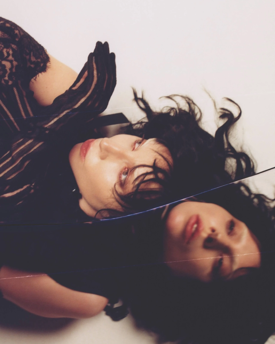
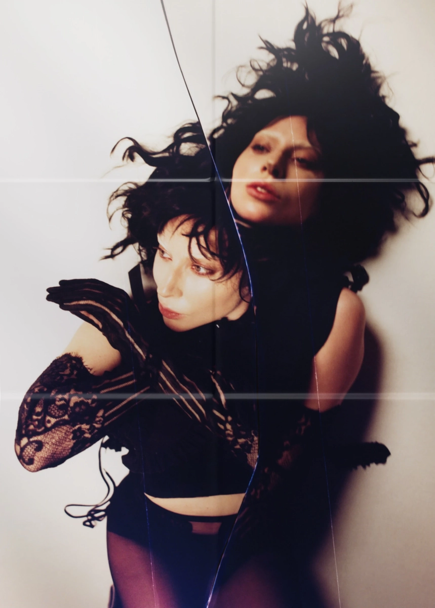
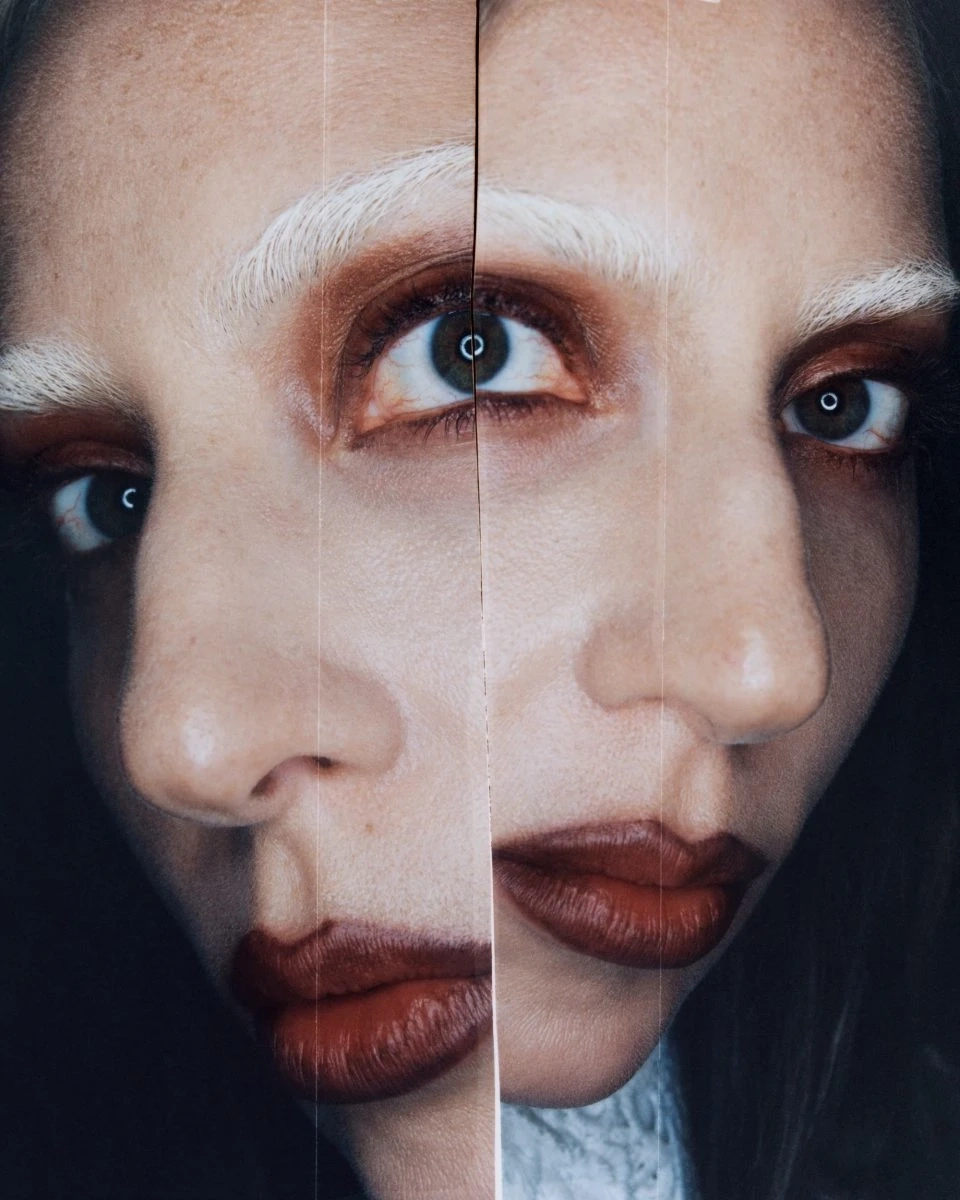
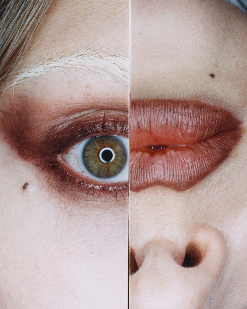
Francis: I am queer, so this is gonna be very obvious. But a lot of this came from Lady Gaga’s seventh studio album MAYHEM. It released early this year when I was in my ideation phase. What she was saying in that album didn’t resonate with me as much as with her past albums, but the imagery of that project is what caught my attention more. Of course, she has her own interpretation for this record, but to me, the distorted images, the dualities, the broken glasses—it all spoke to me as a very evident visual language of shame and conformity and revolt against those two things.
-
-
-
-
-
-
Some shots from Lady Gaga's photoshoot for her seventh studio album MAYHEM.
Interviewer: Of course, it’s Lady Gaga. (chuckles) And that makes a lot of sense; actually, I can see the common elements between your new website and MAYHEM’s imagery. Was there a moment in this where something clicked visually or emotionally that you were just this is it. This is exactly what I want. Or was it more gradual?
Francis: It was a process. It was a process. I knew that this kind of visual style was where I wanted to go, but it took me months before I really nailed the concept. I’m even gonna say, this is the most serious I’ve ever taken a design process. I knew I wanted to tell a story, but I didn’t know what story it was. I knew I wanted to go a darker route, but I didn’t know which exact road I wanted to take.
But there was a turning point that to me was really special. I was porting my old blog posts over to the new codebase, and I came across the photoshoot I did last year which was centered around Creativity as a tool for overcoming Shame. I was reading the writeup, and I was cringing so hard while I was at it so I decided that I would remove the writeup and leave the photos. And I came back to it a week later and had this conversation with myself asking why I removed the writeup. And again it’s still the shame. I was still carrying the shame that I thought I had tackled the year before, but you know, it’s not gonna magically disappear just because you did a shoot in feminine regalia and wrote about it. So I followed my own advice, and used Creativity again to battle Shame. That’s how I decided I wanted to tell a story about shame, and everything just followed from there.
Interviewer: That’s gotta be a different level of introspection, no? For you to come back to your previous work and have a visceral reaction to it. In light of that, what did this version of the website teach you about yourself that you maybe probably didn’t get to learn with the previous redesigns?
Francis: That I was right! (laughs) Creativity is indeed a formidable weapon against shame. Because it’s that nagging feeling that forces you to conform to what you think other people think should be. That’s how Shame works. But when you’re being creative, when you are honoring your vision, regardless of how weird the vision turns out to be, it’s like you are tearing the walls that Shame built down. It wants to put you in a box, and Creativity is like that dull screwdriver that you use to carve out a hole you can get out of. It’s a tedious process, but it works.
Interviewer: That’s a solid metaphor! Creativity is, after all, still just a tool. It’s not a deus ex machina kind of thing that removes all the struggles. You still have to do active work. Knowing all of this, knowing the immense personal depth behind this redesign, what do you hope the audience takes away when they encounter Nico Bursafi? What conversation do you want to spark in them?
Francis: Well, we talk about this project like it’s a deeply philosophical and emotionally moving piece. But at the end of the day, realistically speaking, a website is just a website. It’s not a song, or a painting, or like a novel or something. There’s no lesson to be had, and all you’ll see is a contact form and tens of blog posts no one really reads. But what’s more important to me is to have put a part of myself out there. It’s human nature to want to leave something behind.2
And I want to put something out there that people might see, or they might not; but that’s not the point. Because to me, we are partakers in the act of creation, whatever that creation might look like.
Under the hood
Interviewer: Speaking of the act of creation, there’s a technical side to it. We have tools we use and materials we consume. For this iteration, can you tell us a bit more about the process of how you got into building it?
Francis: There’s nothing new with the tech really. It’s still Eleventy under the hood, vanilla HTML, CSS, and JavaScript for the front end, nothing particularly fancy. But I decided I’ll take a go at animations. So for that I used animejs for animating the logos and stuff.
Also, I don’t know if other people do this. But I went on a premium photo shoot with Schild Studios to take pictures of myself as Nico Bursafi and just put it everywhere on the website. If you are a beginner, you absolutely do not have to do that; photoshoots are expensive. And some people might judge me for that, but hey, it’s a treat to myself using money I earn. (laughs)
Interviewer: Yeah. We are trained professionals here, do not try this at home!
Francis: (laughs)
Interviewer: But this iteration is version 5. Were there problems in previous iterations that you attempted or were successful in addressing in this redesign?
Francis: A big problem of version 4.x was the
growing codebase. We can’t really do much about that, it happens to
everyone. But even when I upgraded to version 3 of Eleventy, there
was still a significant slowdown when starting and restarting the
build process. Also, the code became a mishmash of stuff I created
for fun that I just left there and never touched again. And god, the
Git branching. Good lord! Every change is to the
main branch, so when something is fucked up, instead of
reverting a pull request, I have to hunt every piece of code down
and delete them.
This time around, I paid more attention to keeping things in code
tidy. I followed a Git branching process3
that made sense to me, and that alone made things a lot easier.
There’s a build pipeline attached to the main branch,
and whereas before, I would always be concerned about consuming
build credits whenever I wanted to try new stuff, now I can just do
it in a different branch and test it out in all of my devices before
pushing it to the main branch. It only goes to that
branch once it’s ready for production, which is so absurd to think
that I have never done that. (Laughs) But yeah, I do that
now.
Interviewer: Okay, since we’re in talking about the technical parts of building this redesign, I have to ask: Liquid Glass. Apple recently unveiled their new design language. What do you think about it?
Francis: It’s cute! I love it. But I don’t think it’s anything particularly innovative. I think it’s just a way of setting their brand apart from the rest, because frankly, when you look at Android devices out there, a lot of them started copying the design language Apple has had since iOS 7. And also, I think it’s an indication of their current vision, that they think, or rather, they want to bring us into the space of spatial computing, you know, with visionOS, which in itself also isn’t new since Mark Zuckerberg also infamously tried his hand into the virtual reality space.
Interviewer: Right. But there’s a lot of glass motifs in the 5th version of your website. Was Liquid Glass of any influence to your vision?
Francis: Yeah. (laughs) I’m not even going to deny it, it’s true! I copied Apple. Sue me. (laughs) But of course you can’t just copy things out flat out! When I started the design of this thing, I didn’t know Apple was going to release Liquid Glass yet. So really, the broken glass concept really came from MAYHEM by Lady Gaga. That’s the main inspiration behind it. And also, I’ve been really into Marvel Rivals recently, and their design also had this concept of the multiversal boundaries being rendered as broken glass, so I also copied that and put my own little spin into it.
What I got from Liquid Glass was the refractions. Obviously, because
of technical limitations, I can’t do that for all the browsers, but
for Chromium browsers, you’ll see that when you hover over
interactive elements, the links underneath the cursor doesn’t just
distort, they also refract; they have this chromatic aberration that
I achieved with SVG filters. But because I’m using it as a
backdrop-filter, it only works on Chromium. That
doesn’t mean the site doesn’t work in Webkit and Gecko browsers.4
It’s just a tiny little detail that I added to flesh the concept out
further, but you’ll be fine without it. It’s called progressive
enhancement. (laughs)
Web Design as an art form
Interviewer: So you talked about how websites are more utilitarian in that more than it being expressive, it’s more valued for its utility. Do you wanna talk more about that?
Francis: Yeah, sure. We have this idea that the digital space is just another giant billboard or kiosk where you can advertise and hook people in and get their money. I started web development in college, I was 17, that was in 2016. And that’s what the web has always looked like to me. But I learned about the web’s history, and it wasn’t always this way. We didn’t always see the web as a conduit for capitalistic transactions. It used to be a digital space for self-expression. Before the advent of social media, we had blogs. And those blogs may or may not be styled in a way that projects its creator’s personality. We had web rings, where we connected our website with other websites. We had blog rolls and neighbor links.
And now, the mainstream web has become a marketplace of sorts. It’s a lot of noise, trying to catch your attention at every move of your cursor. And if you are new to web development, you go to the forums, you’ll see that every single developer you come across will tell you that if you’re gonna build a website, it’s got to be a portfolio. You gotta tailor it to the SEO keywords; you gotta think of what the newest tech you wanna work on; you gotta mind how recruiters are going to see your website; it’s very important that there’s a call-to-action above the fold. But every portfolio website you come across will still have some personality to it, which is not something we directly address; it’s something of an elephant in the room. In a way, that era of the expressive web is still with us, we just don’t acknowledge it as much, because we’ve grown into this idea that a web should have to do something, and it can’t be that it just exists.
But to me, there’s also a form of shame that plays into it. I’ve had my web development career for like 6 years now, maybe more since I also worked in college. So there are people who look at my website for inspiration and they wanna see the best practices, they wanna see how I’m tailoring my website for SEO or for the recruiters or potential clients. And that, in a way, kinda puts a box around what I can and cannot do in my website, you know? Of course, there’s no hard rules, but there’s a certain level of expectation that I cannot (or should not) ignore.
But really, all I wanna do is make art. And unfortunately, my tools aren’t paintbrushes or musical instruments; my tools are just code. And it so happens that these tools follow rigid rules, both in the code syntax and the culture we’ve built around them.
Interviewer: And having said that, connecting it back to Nico’s lore, is this also your own way of revolting against the status quo of what the web has become?
Francis: Revolt is a strong word. Let’s just say I wanna do something different. And it’s not like there’s innovation here. There’s a lot of more creative people, smarter people than I am, who has been at this kind of not trying to follow the rules around websites. But I guess what I want to say is that we can call our websites art. And I know this is probably not a problem or anything; maybe people in some parts of the world do call websites art. But I haven’t heard that anywhere in the circles I run in, so I wanted to say it. Websites can be art, they can be more than the utility they provide.
Interviewer: I agree. And I know you talked about being put inside a box, but I think having certain limitations can also encourage creativity, no?
Francis: Sure! Yeah. Especially technical constraints. The web is a notorious being for having so many constraints; if you think about it, what we’ve done with the web shouldn’t have been possible. It’s multi-platform, even a microwave can access the web. It’s backwards-compatible, you can be sure that in ten years when we’ve had Chrome version 2331 or something that the website you created today will still work then. And even then, it’s still growing; we still get new features around it every year.
But also, you can think of the web as an infinite canvas, and the viewport its looking glass. Although the canvas is infinite, you are constrained to a rectangle viewport, but also its width and height changes. How do we adapt to that? How do we create art that’s as dynamic as that? We can’t do that with print. We can’t do that with film. Only the web provides such a canvas, and there’s a wide array of possibilites we can paint our imaginations in.
Not to mention progressive enhancement and graceful degradation. How do you create art that some people on some devices wouldn’t see in its full glory? How do you create something that still works in a browser in a T9 Android phone but also unleash its full glory in a browser inside a gaming rig with an ultrawide 4K monitor? What about accessibility? What if the user zooms in or out? Or they changed the font size? Or what if they have scripting disabled? What if they had dark mode on? Or they want more contrast or less transparency? These are the constraints we gotta work on when we develop and design websites. And obviously, we’re coding it for the most optimal conditions, but we also gotta code fallbacks for suboptimal conditions. And there’s a high level of creativity involved in that, too.
Interviewer: Right. So we’ve talked about the deep personal narrative, the intentional chaos, the visual choices, and even the part of embodying Nico Bursafi in those powerful images. This new website, more than being just a digital presence, it’s also a canvas for self-discovery and a mirror of your truth.
Before we wrap this segment up, what’s one final thought you want to leave everyone with?
Francis: That we remember what the web is. It’s a weird place. Nowadays, it’s been occupied by capitalism and AI slop. But there was a time when it was this weird new technology that only the cool kids new how to operate. I think we forget that. And I want people to remember that time, and understand that we can still do that. We gotta put more weird things on the web, like, you know, putting out an imaginary interview with an imaginary journalist talking about how deeply personal a website redesign is.
We need more weird stuff on the web. But most importantly, like I said, I think we see websites as utilitarian, like its merit is mostly around the utility it gives as a conduit for information transfer, or a means of transaction. But it can be just as artistic as a painting, or a song, or a performance number. So we gotta make more art, and we gotta make it by hand regardless of what the medium is or the tools and materials we have and use. Because there’s really only one thing that makes our art different, and that thing is the soul we imbue the things we create, and that soul is what makes us care about even the littlest of things that no one else notices. The act of creation is an act of devotion, and devotion is a manifestation of divine love.
The act of creation is an act of devotion, and devotion is a manifestation of divine love.