The KWF Diksiyonaryo is probably one of the most used web apps I have. It is the online version of the Diksiyonaryo ng Wikang Filipino, the first ever monolingual dictionary on the Filipino language first published in 19891. This year alone, I have visited it more than 300 times according to my browser history. I just love this piece of software, but admittedly, I’ve also had some gripe using it.
It is no secret that more than aesthetics and design, websites of Philippine government agencies and commissions prioritize utility and functionality. Nothing wrong with that, of course. But my designer self just couldn’t resist trying a hand at redesigning this app.
Use Cases
The official KWF Diksiyonaryo site, as is typical with government websites, could be better. Sure, it works. But there’s a wide room for improvement. I use the Diksiyonaryo regularly, so in this redesign, I tackled my use cases:
- Searching for word entries. Whether looking up the right spelling, placement of accents, or just looking for synonyms, the KWF Diksiyonaryo is already capable of giving this information.
- Looking up words as a pastime. With a physical dictionary, I can flip randomly through the pages and encounter words I am unfamiliar with. This gives a lot of learning opportunities that are unfortunately missing in KWF Diksiyonaryo. Although they do have Tampók na Salitá (Featured Word), this is only updated occasionally.
Front page

The current design of the KWF Diksiyonaryo is reminiscent of early 2000s Web 2.0 sites. There’s nothing wrong with it; in fact, the interface is very straightforward. But it feels dated because of its visual language. You will also notice that although it only has two main colors (blue and orange), they use different shades and tints, seemingly with no purpose to it.

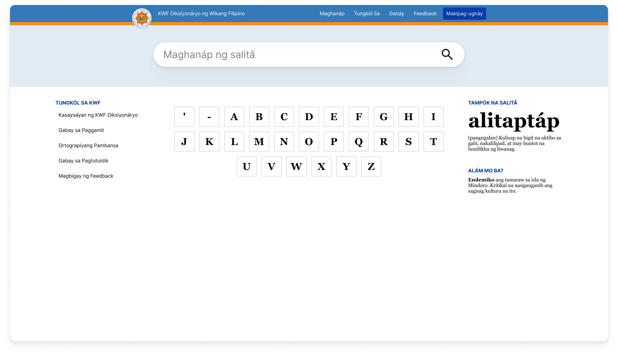
The previously mentioned straightforwardness also leads to the app serving just one use case: searching for words. Dictionaries are not just reference materials; there’s also an entertainment aspect to them when people just peruse their word entries for fun. Let’s redesign this homepage into something a little more pleasant.

In my take on the homepage, we keep everything that works from the original design while adding or revising parts that could be better. As before, the search function is still front and center. However, I reorganized the rest of the page. Unlike in the original, we use color with purpose. We still have three shades of blue, but now, we use them to highlight subheadings, the call-to-action button at the top right of the page, and also to delineate boundaries between elements so the users know where one thing ends and another begins.
In this take, I introduced two fonts, Inter and Georgia. Inter is a sans-serif that’s not too different from Helvetica but still has more personality than Arial. It is very flexible, as it can be used for UI copy as well as document text. Georgia infuses character to the design by bringing a familiar “bookish” feeling to its text, reintroducing the vibe of an authoritative reference material that a dictionary should have, which is not that pronounced in the original design.
To tackle the second use case, I added a grid of letters as an index to all the word entries of the dictionary. It emulates the habit I have where I randomly flip through the pages of the dictionary to see words I am unfamiliar with.
Word entries

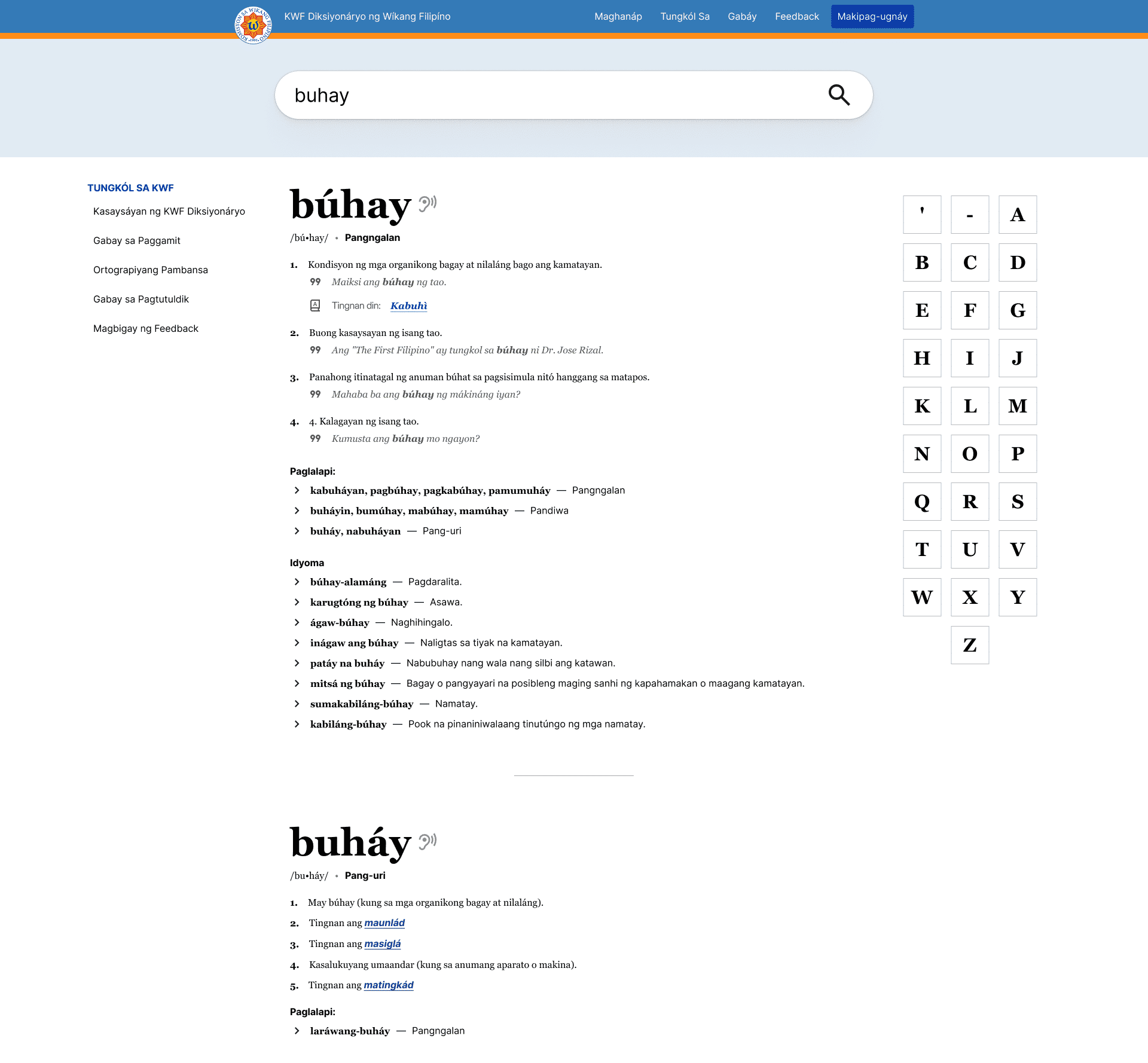
Upon searching a word entry, this is the interface we are brought to in the current KWF Diksiyonaryo. As mentioned, this design works, but it could be better. In this case, fortunately, there are only a few things we need to do as it already gives us good partitions between the sections of word entries.

Most of the work I did was to make things consistent and clearer. For example, in the previous design, the example sentences where the word entry is used are colored the same way as links, which makes it confusing. When text is blue, our decades of experience in using websites will make us click it. And if it’s not a link, the user is confused. In this design, I kept the blue text only for links.
I also introduced icons in the different sections to develop the design’s visual language even further. Sure, a dictionary is about text, but icons still help in making things easier for a glance-through.
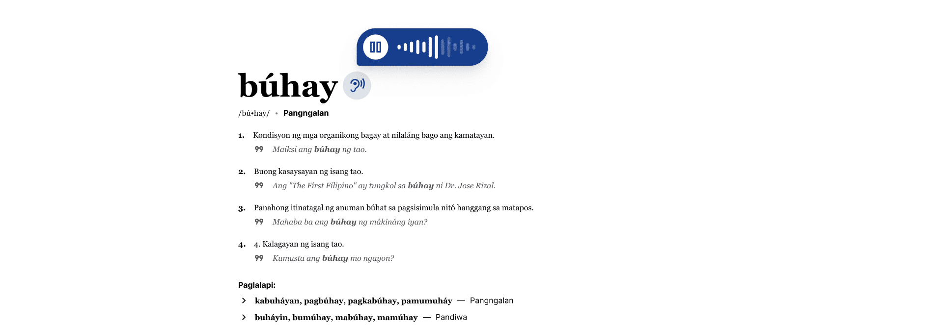
You might also notice that I added an icon beside the word entry. The Filipino language has three accents, and they are not widely used in popular media. In fact, this dictionary is one of the very few media I consume that use accents. Granted, Filipino words are pretty straightforward; you pronounce them the way they are spelled. But accents can sometimes be confusing, so it would be nice to have an audio recording of how the word entries are pronounced. This would also help people whose native tongue is not Filipino to learn how words are pronounced.

Conclusion
This project is made entirely from my heart. I would love to work on actually redesigning the KWF Diksiyonaryo, so if you are a staff member from the KWF who is interested in making these designs come to life, please, please, please, contact me.
